


Jonah
Basement Art & 'made in' Basement Art...
 |  |  |
|---|---|---|
 |  |  |


April 22 to May 5, 2016
Dr. Ronald J. Lee Jr.
Blitzkrieg Bridge Cathedral
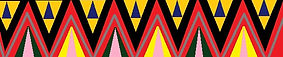
The art image (on this page) was painted by priming with the gel of the acrylic not so well mixed and smothered evenly on the dry canvas so it remained wet for some time, black design edges, sideways 90 degrees and more woven looking stripes down again – then, colored drips and drips even continued as turned 90 degree canvas to alter their path – that like rain and water off the glass or in home during a heavy storm, roof line and bell tower, colors into the points as more major entrance markings and these as bright on the darker dripping –the sky was painted by light blues and whites mixed after a little grey, entrance way as foreground by mixing violet and blue with white gloss and complimentary orange to yellow mixing – accentuation of the form edge lines with black paint and some white to make contrast in value from the more grey values, texture by paint overlapping and dripping patterns as well as hues selected with primary and secondary and mixed tertiary colored paint, space by the form as a massive – space as technical space and the spaces between every dripping line as elements of art to mention and use in describing my application of acrylic paint – beginning as a plaid drip work flag and becoming a batman mansion church as cathedral with dark looking structure and some brighter points for dynamic duty…
-
Work with the angles of the roof to make an inlet by parallel like shapes and edges to slope downward to right side
Paint a dark wall thin inside the from base of that inlet to the roof too
Go high on the inlet from base 2 plus inches to slope downward
-
Details:
-
Cat walk on roof – finite and edge for line and shape to show
-
Arched entrance – no base for the elusive and imagination
-
Side of front entrance as shade area shape of black – the absence of color (all colors together are white)
-
The circle of black in the axis of the roof joint front face
-
Bell tower as much more well shaded as values darkened
-
Roof line left side for an edge that is form on form
-
-
Painting actual applications:
Carefully brushed acrylic and water – to make sure the drips are not compromised
Consideration for all the shades and shapes to lines and over all composition as my preference to balance with severe double and triple checking over – for anything that is obscurely too much or not enough – maybe even something which is not seen…
-
The indecision and calling for the color green as base like lawn for the finished rolling out of the green grass a painted carefully to blend into what exists and regarding what is there at base as a major complimentary color scheme – to be or not to be… (what it looks like is a rainbow spread from purple to orange at base – which is another half circle according to the color wheel – an arch by color and a true rainbow effect able to build upon…)
-
Adding in grey bush and the base as green mixed areas of brushed on white – quick like – sashes of base contrast to bring it forward…
Yellowing the light of the bell tower left side…
The grey of the circle of blackness in the axis of the roof top…
-
-
A rainbow sky reflects what I said about the ground. Deviating this idea – right here for where to use it as it is about night and moonlit skies from sunset – that not as day time rainbows at all, on no, no no no… but, saying it typed – that credits it because it is where and how it arrived… - Bob Dylan, Father of Night. Paint an Eclipse – would it be an eclipse? Sun behind the moon as from exps at home (seeing the most recent Eclipse a few months ago in 2016) … Pink Floyd & my exps as at home with this music becoming art… I draw the moon crescent shaped as a wrong idea – the technicality is that the moon would be opposite sun and earth between as crescent – full as very near in universal pertaining – because it lights it up with the earth not ion the light if the sun… - education of mine too – and, if I’m wrong, interest in it to learn it right & as if I’m right, praising it and priding in it for me to really satisfy myself as righteous! Learning – art is and gets messy – like how we feel the greatest and most pure moves made as perfect set – well, learning – you will find out that even changing the purest pussy and perfection to erasing lines as making love – that whole mix will practice and make more for it is intended to do – be fun and exciting… the red (@ night, my delight) to purple sky (Purple Rain recorded and written by Prince would do so well to help resound this art work for what it truly represents from my head) as a sunset – it cannot exist because the sun is behind the moon, so, all light is darkness as very dark darkness… therefor, black painted skies and anything else is modern to surreal inventive expression of art- like Star Wars (by having 2 suns in the movie seen way back) and the Police – 2 or ‘invisible sun’… obviously, the light from the moon is ‘overly emblazoned’ by the sun which is behind – so, the clouds – must be very weird… Transylvania and demonic… - somewhat to get the sense and that sense is maybe linked to why people go crazy during the eclipsing sun and moon and why that is balance matters as for equilibrium as what it is which makes us frantically suck her blood… ah-whooooo…
-
Lines in roof for old fashioned stone roofing as castle or church like – as a cathedral would have very well design and crafted roofing for this grand scheme art work idea to be a full composition… look, no light.
-
More details as from entrance way and some lavish exploration into obscurities – since I‘m making design art work realistic – try some surreal – float the reality into the air and design some music notes and scales from the entrance for a friendlier and loving house inviting grand entrance…
-
Lighten the green – subdued and by lighten by mix green with white paint – to keep consistent about values of the fore ground. But, contrast upfront – leave the paint there upfront as close to edge at base and smooth it blend together as it goes backward (or, technically, up the canvas).
-
Some clouds and birds for nature and maybe a space mix of stars as the surreal time flying day to night effect and look when I ‘m done… - some clouds are there – paint around what it there as use what is there as both artist and absence by like using the page for white, but, to make use of more directly and inexpensively, aka, going green…
-
A walk way of stones and logs maybe – a more summer camp cabin effect look as the golden logs of the day of the chief scouting executive summer home summer camp grand extra-ordinary offices of those people as who maybe be these cathedral owners or workers for the way it is like other things:
-
Magnum, schools with priests or clergy or nuns, butlers, maids and maybe the life from knowing this is good to know of, too…
-
Structure as ways to relate like school and use of subjects.
-
Bushes some more without stealing from their art by my own say to trust me about my marches and beach dunes seen along the way as my own light browsing over as passing bye… and, art I’ve seen as inspiring me for marched lands, bushes and water reeds - the idea is about inspired and use of the image in any way to try to get enthusiasm in art making around...
-
-
The Crunge, 'take it to the bridge', Led Zeppelin - titled from this similar motif as what the lyrics may mean - music to art, Blitzkrieg Bridge Cathedral.
-
the final 4 photos were between painting sessions late on Tuesday night and they applied the strokes of genius which made the art owrk so much more as detailing and finessing over technical appeal... (the world may never know - to whom the appeal applies)
-
the arches to the right side and the brown trim on the left make up the after effects for my use of design details back into paint mastery modern art work...
-
gold sunset acrylic on the left side for cathdral main and bell tower - covering the wretched mess which plies to keep it strong...
-
the dark shapes added I lower portion left and right are about the 23rd photo in slide prsentation marked as 1,2 & 3 for places which I designed for which I felt required black applications as acrylic paint....
-
I cleaned up my runs of paint – drips neatly converted over to the likeness of grains and textures for the more accurate effect as non-challan and not such the main feature – that I used drips to build it is right as my use, but, to document and strive forward as moving ahead…
-
Later, I painted the entrance and cast out the shadows of rainbow drips and stroking’s of brushes with colors bright and dragged over as more lavish and serene to first see. I made sure that the steps were securely painted around and that same entrance had not one but another coating of paint application from light grey to khaki…
-
I cleaned up around the arched windows on the right side of composition. I cleaned up near the iridescent flower bushes below – nearly lit… (use of exps)
-
I painted the sky all black paint as absence of color – knowing that is weird, but, reality – all colors together make white- the opposite is absence and space which is another elements of art…
-
I painted over a few stones on face side of the house.
-
You never knew that I had this kind of art strength. I just had a thought come to me as someone repeated what I thought you said to have fun with it at first that means take it and slap the paint and dragging the brush around, onto my canvas. I use patterns and shapes as I see it fun like that - drips made sideways and then curves around it reminds you something let me start painting it that's like the arches that exist within the within the zipper you know what I mean, like a girl rubbing up against... elements: line, space, shape, texture, hue, form & value – 2D & 3D.